
CloudCheckr
A collection of projects & feature work.
Problem Statement and Overview
The primary objective was for a wholistic redesign of the user experience of the CloudCheckr web app. To make the app responsive, secure, and accessible, were our goals. Scaling the product for large enterprise clients (over 1k+ accounts) was our chief goal in the redesign efforts.
Company Size
10-1k Accounts
Technical Considerations
Customers with 1k+ accounts create additional demands on the backend. The amount of customer data needs to be taken into consideration. Larger scale customers will require more technical load.
Design Considerations
Must work for clients with 1k+ accounts
Must be accessible for government agencies
Must reflect technical considerations
Role
Design team lead
Project manager
Product design
Information architecture
Projects
Projects included a redesign of the visual design of the product and external branding including iconography, fonts, and design system usage. We created:
a customer dash boarding page
designed a notifications system
customer profile pages
new login screens
account quick switcher UI
Prototypes for native iOS app
Demo mocks for VMware migrator
Site wide UI audit
Creation of a design system
New search toolbars

Introducing design into a company can be hard. To help integrate these efforts, I organized our first design sprint.


CloudCheckr VMware Migrate

Problem Statement and Overview
The primary objective is to design a solution that makes vSphere cloud data migration easy via CloudCheckr.
Users need a clear means of understanding how to manage their cloud data no matter where its stored. Through this iPad application we mean to clearly depict how the migration process would work; how to transform infrastructure with cloud migration for VMware vSphere. Boost productivity with CloudCheckr’s centralized cloud management tools, global insights and automation.
Power up with add-on cloud services.
Technical Considerations
This application is built for on-the-ground sales associates carrying iPads.
Design Considerations
Must work on iPads
Must be able to work for companies with 100+ accounts
Project
We were asked to design an application for iPads that allows for sales associates to easily allow customers to visualize the migration process; and to show seamless migration of data stacks in VMware vSphere. The main purpose of the app was for depicting the migration process of cloud data within the customer’s vSphere and then migrating or moving clusters within the customer’s stacks.
Product Design
Branding /Art Direction
White-boarding
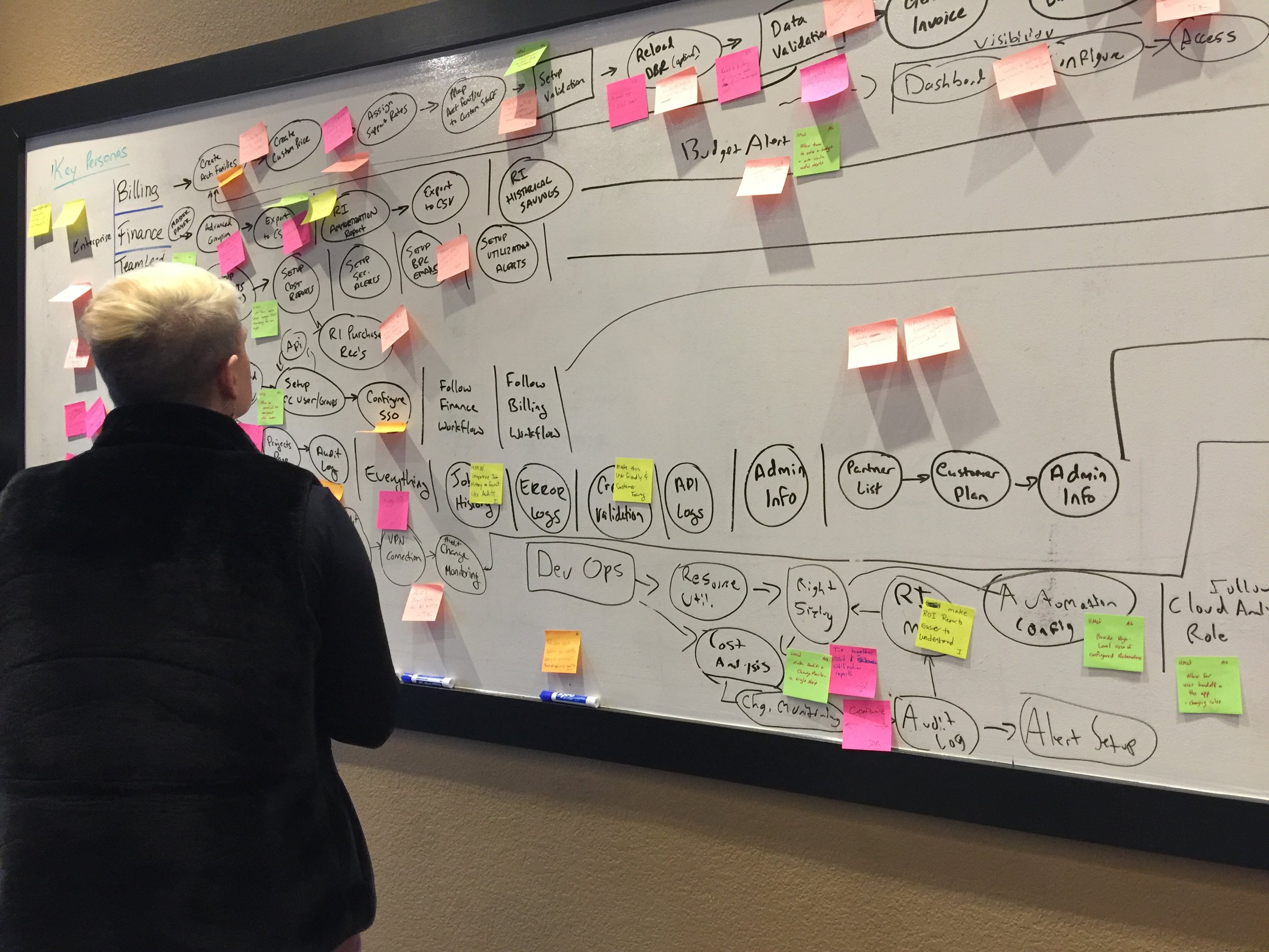
A pivotal step in the process at CC.
All projects including this, begin with several white boarding sessions. These sessions include Design, Product Management, and Engineering team leads. They may also include Sales reps and CS reps. To begin a complex project like this, it is essential that we clearly understand the problem and have looked into initial solutions as a team. These sessions may also include customers if the team needs more understanding of some technical or unique to them issues.
Projects will often involve more than one session and will occasionally include additional follow-up sessions if needed. It’s the best opportunity to get leadership from all teams, in the room together focusing on the problem at hand while keeping technical considerations and product roadmapping in mind.


Cloud architecture is broken down into location clusters, hosts of servers, and then individual servers. This is shown in the UI on the left beneath the logo. The user can search within the search-bar by selecting the search icon or can select one of the icons in the icon tabs for Clusters, Hosts, and Servers. This screen shows the dashboard for Host 6, shown by the green selection icon in the UI.

The search icon slides out upon click to show additional selection and sorting options.

A top level view of all the clusters within the customer's account. A cluster card shows a summary data usage of that cluster.

CloudCheckr GO an iOS app

Problem Statement and Overview
CloudCheckr currently has no mobile app. The SaaS web application at this time, is also not responsive.
Users need a clear means of understanding how to manage their cloud data no matter where its stored. By designing an iOS CloudCheckr app, users can view all their most critical data, at any time and on the go. They can use this application for quick talking points in meetings; it is also something other members of leadership can download and easily use to view key analytics.
Technical Considerations
Mobile app designed and constrained by mobile OS systems.
Design Considerations
Must work on multiple sizes of phone.
Must be able to work for companies with 100+ accounts
Project
I took on this collaborative project with the Content Manager in our Marketing team. We were going to show how easily we could design and build a read-only native app for the purposes of seeing real time data analytics, without needed to be constrained to a laptop. We used this prototype to gather user feedback at sales and marketing events.
Product Design
Branding /Art Direction

The iOS app takes the Best Practice Checks (BPC) page and breaks it down for a quick and easy viewing.

Data tables and search tool bars
Data tables and searching patterns were reviewed and redesigned. To begin, inventory of existing search and. filtering patterns were gathered from partners and competitors alike.


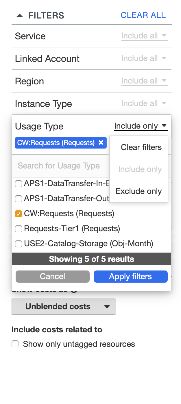
An example from competitive UI analyses. These are AWS vertical filtering toolbars, showing drop down options and other UI elements, as well as parameter options.


Original accounts page or MAV (multi-accounts view) data tables prior to redesign.

What do you do?
Responsiveness of tables needs improvement
Too difficult to navigate between cloud providers
No ability to handle large customer account loads (1k+)
No inline actions available, too difficult to edit
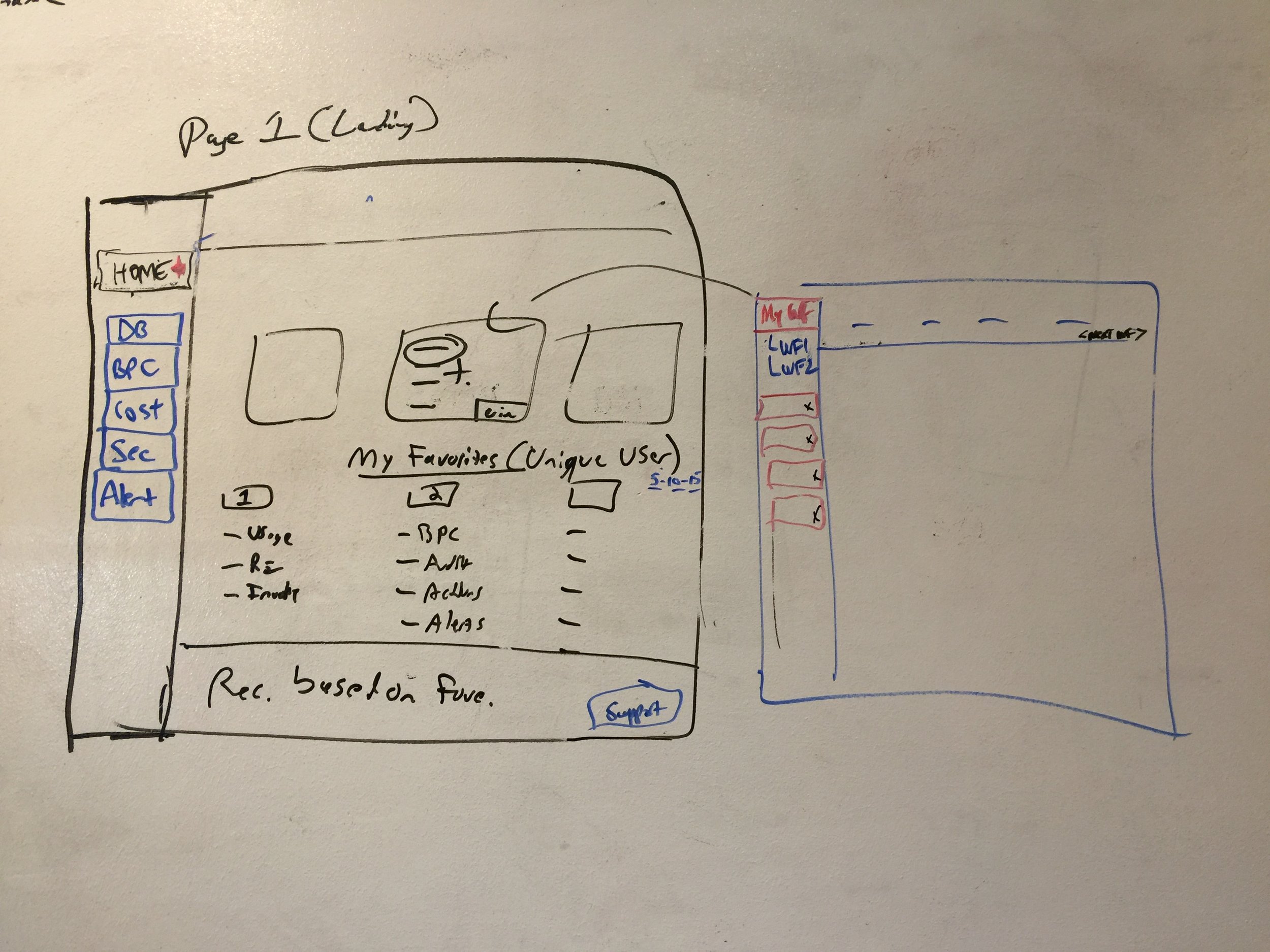
We wanted to introduce an easier way to navigate through 1k+ accounts by designing a navigation search panel. A sidebar design was chosen because it optimized screen real estate and would be easier to implement for smaller screens. For optimal viewing drop downs and collapsable menus were implemented.
Below are some mockups experimenting with table layout and visual hierarchy.


Mock of accounts view or MAV sidebar navigation. With options to add new accounts, add MAVs, navigate between providers if the account was split, or add a provider. One a provider is chosen, the accounts appear in the side panel below.

Another version of this mock. The visual design at the top is adjusted to mark distinctions between action items and navigation panel below.

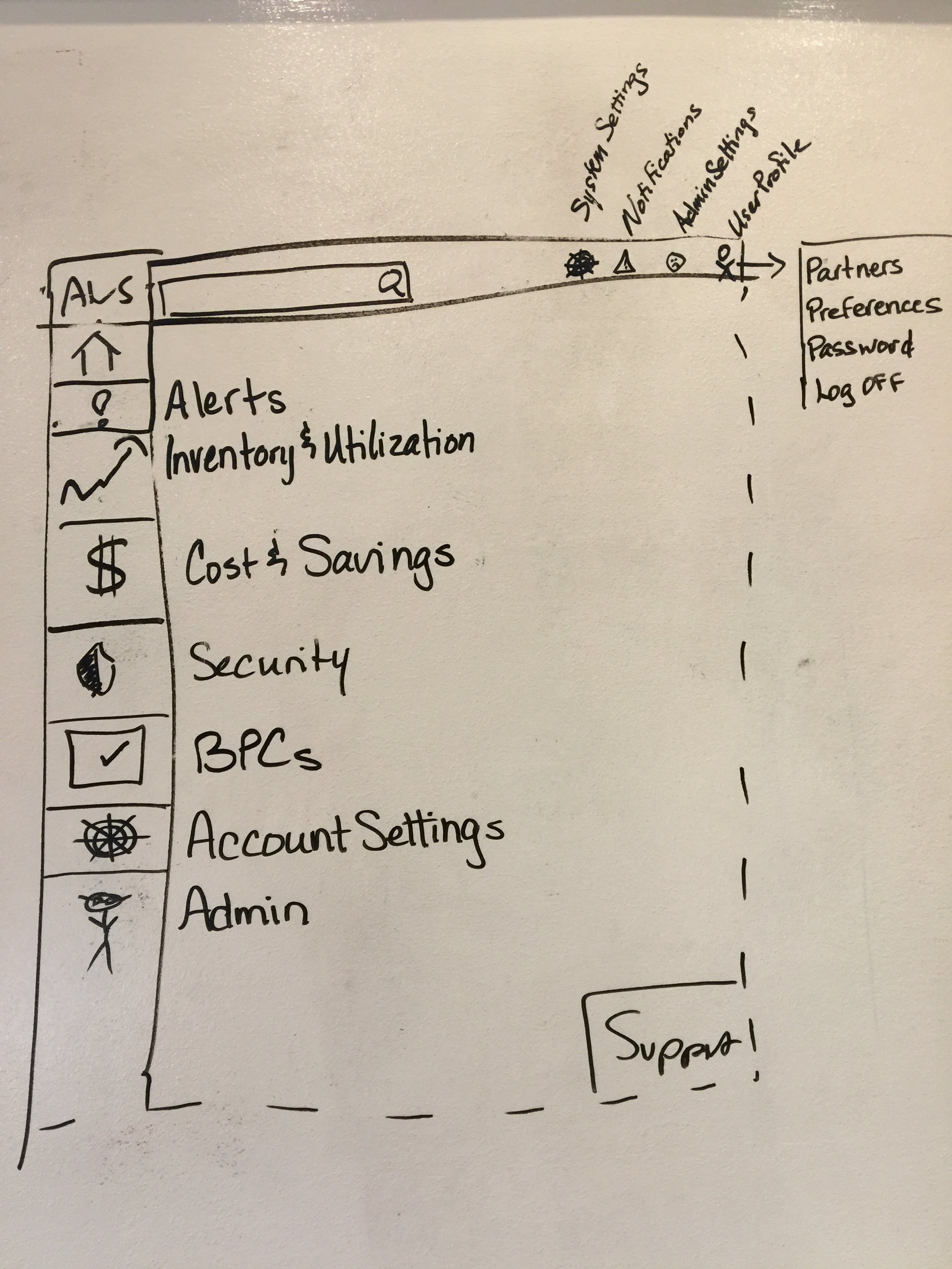
Mock of data tables redesign efforts showing new navigation panels on the left and cleaned up table with show more button. Example of sidebar search tool on the right hand of the screen.

Side bar search tool slides out and overlaps data table to show additional parameters and download to CSV.

Mock of new creation and edit input forms.
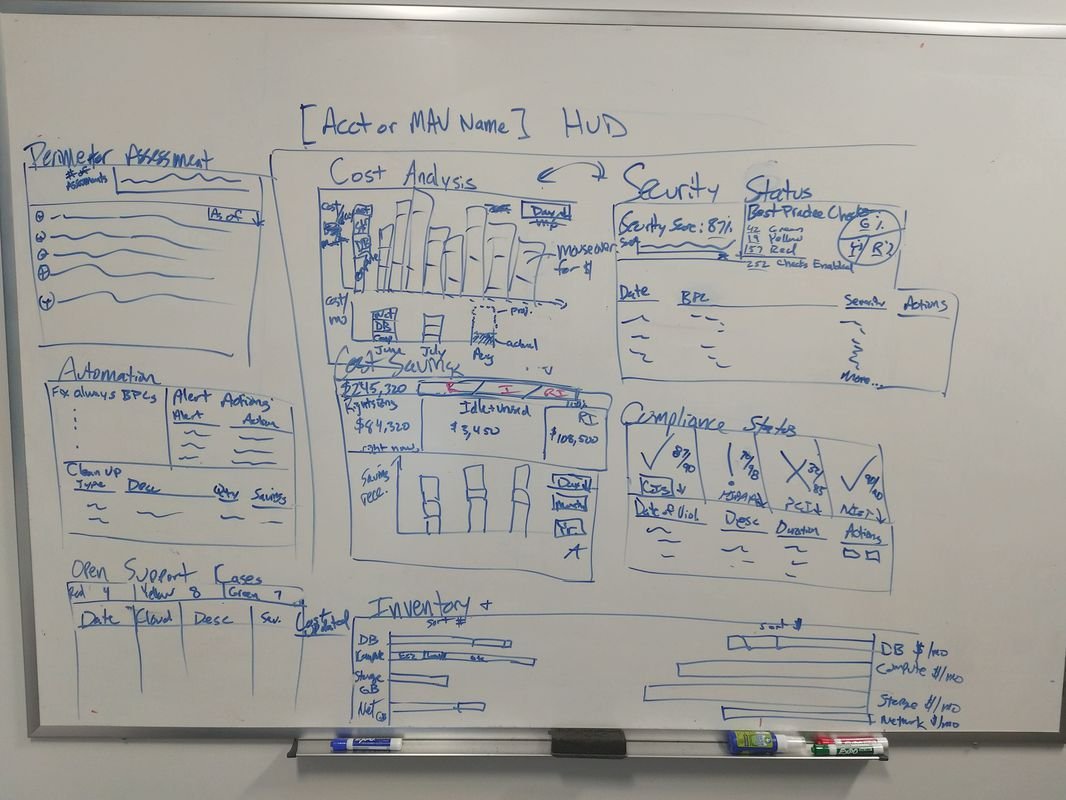
HUD Dashboard
This project was to design a main landing page dashboard that would display a visual summary of the customer’s accounts across the board. The data sections were themselves all adjustable downloadable reports.
Role: Design Lead, Project Manager

White-boarding
A pivotal step in the process at CC.
All projects including this, begin with several white boarding sessions. These sessions include Design, Product Management, and Engineering team leads. They may also include Sales reps and CS reps. To begin a complex project like this, it is essential that we clearly understand the problem and have looked into initial solutions as a team. These sessions may also include customers if the team needs more understanding of some technical or unique to them issues.
Projects will often involve more than one session and will occasionally include additional follow-up sessions if needed. It’s the best opportunity to get leadership from all teams, in the room together focusing on the problem at hand while keeping technical considerations and product roadmapping in mind.
Gain actionable visibility.
Get deep visibility into current and historical cloud spend. Know what cloud services and resources are in use, by whom, and how they are driving costs and consumption to make informed decisions based on accurate data.
The HUD dashboard was designed to surface all the customer’s highest priority data, in one place. Instead of navigating to each reporting page, they could quickly and easily see their cost analysis or spending forecast right up front. Each summary card could be customized to fit the specific needs of the customer. Then upon logging in to CloudCheckr, this would be their primary interface.


